dkilo is a street-level digital advertising platform.
In addition to helping brands reach their target audience in a more dynamic, expressive, and engaging manner, they create opportunities for collaborators to earn passive income as they travel around cities.
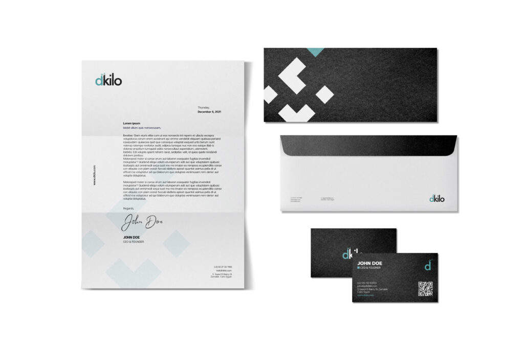
Given the variety of personas that dkilo targets, a brand strategy was necessary to communicate the brand’s goals and values, and the brand tone and persona were carefully chosen.
The logo concept was inspired by the dkilo’s name concept “Digital Kilometer”, the letter D is pixelated similar to dkilo’s digital screens, and it’s digitizing the distance.
The logo is designed in lowercase so that it stays friendly and indicates a casual and informal tone of voice.
The logotype is geometric, giving off a simple, modern, clean, and neat vibe. The logo is built on circles and squares. It acquires a good x-height which makes it appealing to the eye. Also, the kerning is well thought through so that it looks visually balanced.