The Eclair Shop is a startup bakery and coffee place in Paris designed for franchises.
The concept was to change how people look at this elegant French dessert and turn it into a new healthy day-to-day product that can compete with donuts.

To change this perspective, a friendly logo with vibrant colors was or way to solve this problem.
The logo was designed from a retro font that has a bubbly and creamy look and feels to it; retro always looks familiar and nostalgic, yet modern. We also used fresh colors inspired by the many flavors The Eclier Shop serve to the customers.

Color Palette

#003C8C
#6FD6C3
#ED3B2A
#8364F0
#FFED50
#F05886
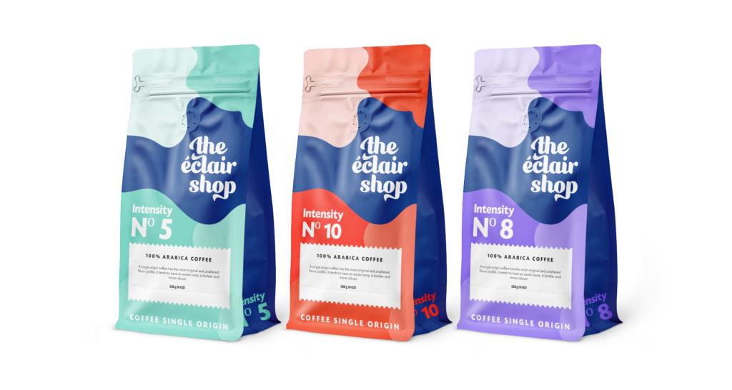
“The Eclair Shop” packaging design is a refined and playful creation that expertly showcases the bakery’s specialty treats: cream puffs and eclairs. Its predominantly white background is complemented with playful splashes of blue shades that give it an energetic feel, highlighting the brand’s commitment to creating handmade, delicious desserts. The overall effect is one of casual elegance, making it an excellent choice for businesses that want to convey a friendly and approachable image.

Choux á la Créme

Èclair

Coffee Cups

Coffee

This coffee brand’s packaging design effectively differentiates product variants through color, with a bold white logo on a dark blue background splash tying all three packages together. Each package features a different shade of color based on coffee intensity, clearly communicating the strength of the coffee inside while also adding visual interest. The design effectively communicates the coffee’s strength and maintains a consistent visual identity across the product line, appealing to coffee lovers seeking high-quality and visually appealing products.

Some More Cool Projects